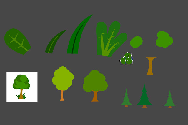
I had to create all map elements so I began by using very simple shapes to build up a tree. I created a deciduous tree and an evergreen tree to further emphasise the leafy green landscapes of Great Malvern. It was an important consideration for me to always make Great Malvern look inviting and 'green' so that the underlying theme of the brief, that of environmental awareness, was subtly expressed to the viewer. I created four different trees to rotate in various sizes over the map.
I enjoyed the freestyle aspect of the tree and building design part, as I could be a bit more creative and not conform to the grid compared to when I was making the icons. Below, are examples of the trees, park equipment and buildings. I also designed a compass, which did not end up in my final design following vital feedback.
For the typography I wanted to use a Modern Looking Sans Serif, so I arranged some for comparison.
I chose Berlin Sans FB Demi for this project because it will strike a perfect balance between being formal and appearing hand-made, in keeping with the illustrative approach I am taking. With the font decided I could move onto creating a logo for the E-bike route. I knew I wanted the bike to be the main focus of the logo, with a sense of movement. I also wanted something natural in the logo, which is the sweep of the hills. This could also be a rush of wind, or speed, giving the sense of moving on a journey. I also wanted the bike to be slightly angled to express the route being uphill. I wanted the E to both emphasise the environmental credentials of the bike, and so it would demonstrate a route or path beginning. I also thought the logo allowed for different colour palettes to be applies to it, depending on the format the map was being displayed. For example, my main logo for the phone and A4 piece would be white, but on the display board I used the logo to lead the eye down to the map by applying a pale mint green to the logo. This was effective, as it created a route for the eye to follow the needs of the information board.


Comments
Post a Comment