Week 1: To begin we had an Introduction by our lecturer, who described to us the world of Information Graphics. We were able to recognize what Information Graphics is, which is the ability to relay large amounts of information and complex ideas with clarity to a user/reader.
Having the ability to decipher information in a simple and quick way is essential for everyday life, and is necessary for functional things like, traveling & way finding, using equipment & machinery, graphs & statistics, maps & timetables and much more.
We then looked at the History of Information Graphics including early black and white cut away drawings of architecture, which showed buildings as if the walls were missing so the rooms could be viewed.
https://www.britannica.com/technology/submarine-naval-vessel
Oliver Byrne used simple graphics in 1847 to visually explain very complex mathematical equations. He used shapes, bright colours and lines to clearly define boundaries and connections to these sophisticated ideas.
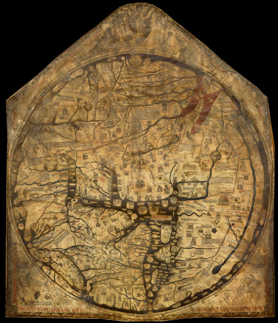
While we were on the subject of the history of information graphics we looked at the Hereford Mappa Mundi, which is a medieval map of the world dating from 1290 AD. Believed to be the largest and most intact ancient world map, it is not meant to be geographically accurate but is more of a schematic allowing travelers and traders to see great cities and landmarks, important rivers and seas.
https://en.wikipedia.org/wiki/Hereford_Mappa_Mundi
Another historical mapping effort, although more recent came in the form of the Tube map for the London Underground created by Harry Beck in 1931. Beck was an technical draughtsman working for the Underground signals office and came up with the map in his spare time. His iconic map used essentially electrical wiring circuit diagrams in the place of railway lines giving each one a different colour. The geographical distances between stations were removed in favor of just showing which station was next on the line. This was innovative for the time as most train and bus maps tended to show geographic locations as a priority of importance.
Harry Becks first initial sketch looks very much like an electrical wiring diagram.
Becks final map in 1931.
https://metropolitantojubilee.wordpress.com/map-graphical-approach
We watched another more in depth documentary about the London Tube map. Although this is quite old it is still relevant and packed with useful information.
This provided me with much more information on the thinking and processes involved in creating the Tube map and gave valuable insights into how Harry Beck started and developed the map further and included interviews of the people involved in graphic design and transportation wayfinding.
Below are some notes I took whilst watching the video, which helped me to highlight some interesting points.
Another element of infrastructure that was in desperate need of updating was the British road sign system. Post war automobile technology had advanced a lot since the 30's and cars and trucks were much faster and roads had improved greatly and a sign system was needed to account for this. Jock Kinneir and Margaret Calvert created a new system, initially wining a commission to create the signage for Gatwick airport in 1957. They were awarded the commission to create the signs for Britians first motorway in 1958. This was then extended to cover the entire road network in 1963. By using typography with capitalised first letters and lower case letters allowed motorists traveling at speed to scan the overall shape of the word. They realised that people are better at recognising shapes rather than reading every letter.
https://www.londondesignfestival.com/medal-winner-2017-margaret-calvert
Another popular form of info graphic was the cutaway drawing which allowed viewers to see directly inside complex machinery, places or even plants and people. These were like the early architectural cutaway drawings we initially looked at but this time with an unbelievable level of detail, which usually leaves the viewer intrigued and awestruck. Particularly when machinery is the subject, panels are rendered invisible giving the viewer almost x-ray vision allowing them to see the intricate working of things in operation.
https://conceptbunny.com/mikoyan-gurevich-mig-15/
We then watched a Ted Talk by David McCandless called The Beauty of Data Visualization.
David McCandless is a designer and author of bestselling information graphics books, and strives to make the world of information clear and easy to understand. He runs blog InformationIsBeautiful.net. Making the information elegant and beautiful allows the reader to absorb the information without becoming overwhelmed.
We were set a task to create an information diagram based on the process of how sunlight heats and melts the polar ice caps.
Below is my response:


Comments
Post a Comment