A new design brief has been created to help promote an Ebike scheme that will allow people to navigate from the central train station into Great Malvern and beyond.
People can rent an Ebike from Great Malvern and use it to visit interesting sites and potentially give a boost to the local economy. The Malvern Town Council and the The Local Enterprise Partnership want to encourage ‘Green Tourism’ while also giving a boost to the areas tourism economy.
There are many partners in the scheme and include: the Malvern Hills District Council; Malvern Town Council; The Local Enterprise Partnership; and both railway companies that service the station.
Who are the clients?
Your clients for this project are a partnership between: West Midlands Trains; Great Western Railways; Malvern Hills District Council; and Worcestershire Local Enterprise Partnership (WLEP).
Who are your audiences?
Families and leisure cyclists from local towns and cities, arriving by train at Great Malvern Station.
This is a unique opportunity to use our design skills to create Information Graphics that can be part of an exciting new Ebike scheme.
Design Requirements:
I will research other cycle schemes and tourist information guides to gain insights into how others display information graphics.
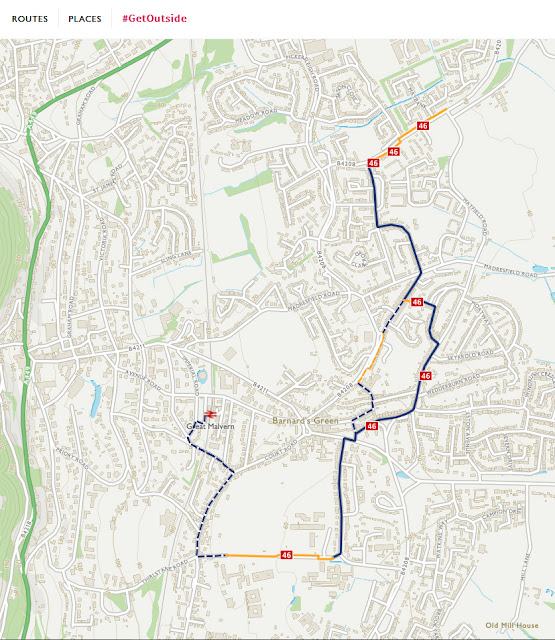
OS Maps: The National Cycle Network connects up to Great Malvern Train Station
https://osmaps.ordnancesurvey.co.uk/52.11229,-2.30529,14
Teme Valley Trail Guide:
https://www.visitthemalverns.org/things-to-do/walking/teme-valley-trail/
Ebike cycle scheme Dundee:
https://themill.scot/projects/electric-bike-sharing-scheme/
Nantes Tourism Bike N Tour:
https://www.nantes-tourisme.com/en/visit/bike-n-tour
Budapest City Ebike Tours:
https://www.budapestbylocals.com/e-bike-tour-in-budapest.html
Brighton & Hove EBike Share:
A collection of wayfinding signage and boards:
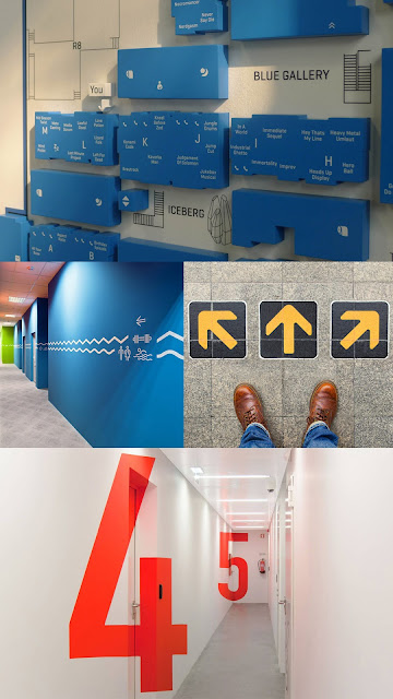
Below are examples of effective wayfinding signs that have been painted directly on the wall of buildings, which is an efficient way of creating signs that can use existing infrastructure.
They are bright or contrasting in colour and often oversized so they can be viewed from a distance and still provide useful information.
Below are some more examples, but this time they have been further integrated into the building architecture. They are rendered in such a way that they provide wayfinding information at unusual angles as they are approached.They can be on the floor or on the walls.
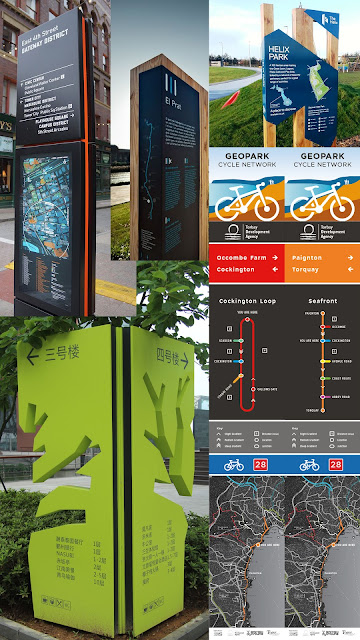
Here are some information boards that are relevant to my brief: You can see different examples of wayfinding boards in the outside world in cities and parks.
The are often made from materials that compliment their environment but must be easily recognisable as a place to get information. Some of the information boards provide descriptive information as well as visual information like maps and arrows.
I looked at some information boards currently in place in Great Malvern to gain an idea of the style and aesthetics involved with making an information board.
A brief from Torbay Coast and Countryside Trust created a need for an information system for the Geopark Cycle Network, this is a nice example because it uses very simple Isotypes showing arrows and chevrons, along with a very simple tube-like maps showing the cycle route in its most basic form. There is a legend underneath to help the reader decipher the route and then at the bottom is a full map of the area in detail. Although this board looks simple it does a good job of providing a cyclist with all the information they need for their route.
www.behance.net/gallery/15820803/Geopark-Cycle-Network
http://fruition-design.co.uk/projects/cockington-valley-loop/
I also looked at other existing cycle rental schemes to see how they incorporate their advertising and information boards into their bike infrastructure. Again, like typical city or park information boards we see a mix of text and visual information often involving a map.
www.citywayfinding.com/about-us/
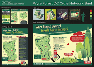
After collecting various ideas and creating wayfinding and information boards, we looked over some previous student work that was created in response to a brief for a cycling trail in the Wyre Forest. This would provide us with valuable insights into how a similar brief has been approached.
I was now gathering lots of information and ideas which were going to help me create a rough layout for my own information board in response to the brief. We now also had a confirmed route in the form of a map, and after various questions aimed at our lecturer and relayed to the various people involved in creating this brief, we now had some clear parameters to work with.
Below are my initial ideas for some information board layouts. I also created a checklist of essential items that I would like include into the information board. By visualising it in this way it allows me to prioritise what information is relevant and what is not.
Although very basic at the moment, this layout will allow me to arrange the information into a visual hierarchy that will be suitable for this brief. With some further research into information boards and existing wayfaring maps I will be able to develop a useful layout and colour scheme.
With these second roughs I played with the arrangement of the elements that would be used on the info board. I must be aware not to overload a reader/rider with information and allow enough space around these elements. Lessons I have learned from other graphic design modules will help me to create a clear and coherent layout.
Below are some colour palette ideas and combinations, however, I feel I am not quite ready for a colour selection yet but I can already see how important the colour scheme is going to be so therefore wish to consider this longer. I am also aware that green as a predominant colour fits well with the environmental aspect of an Ebike scheme and could be a strong feature of my information board.
When looking at existing colour palettes from other cycling schemes I found that they use a wide array of colours and particularly contrasting colours. For example, on a map you will want to use a different colour from the background to make waypoints and landmarks stand out. Also the cycle route itself should be bright and clear. I will continue to look at existing wayfaring and cycle maps, or any other relevant material, to gain insights into how I can create a successful colour scheme.
Before creating more detailed roughs I decided to look more closely at information boards and what other companies and design agencies do to create their signs and wayfinding furniture.
Below are some commercial websites which provide valuable insights into sign creation and they often carry out their own case studies and publish their findings.
https://www.shelleysigns.co.uk/
https://www.signbox.co.uk/architectural/wayfinding/
https://trueform.co.uk/category/wayfinding-signage/
https://hollywoodmonster.co.uk/products/wayfinding-signs/
When looking at these commercial solutions to wayfinding I found that a very popular format for displaying information is the "Totem" Information board which is an effective low footprint solution to wayfinding furniture in a city.
The Totem board is often a tall and narrow structure ranging from about 6ft to 8ft tall and about 1.5ft to 3ft wide. They are often only a few inches thick and either double, triple or quad sided and are usually self standing structures being placed directly into the paving or concrete.They are usually made from strong weatherproof materials like stainless steel or ABS plastic and some are made wood where environmental impact is a concern.
They may contain a cabinet like advertising boards or the artwork and graphics are applied directly to them. They must be able to withstand a certain amount of abuse from pedestrians, pollution and even wildlife like pigeons perching on them. They should also be placed with consideration so as to not block any access or views that could affect traffic.
Below are a few more interesting examples:
https://www.lab23.it/fr/product/mobilier-urbain-totem-wayfinding/
https://www.cldesign.com/aux-tuileries/
https://www.behance.net/gallery/27886799/Barcelona-Points-of-Historical-Interest
http://dotdash.com.au/projects/sunshine-coast-regional-centres
From looking at further examples of information boards I have decided a Totem design would suit the requirements for this brief. It could either be a permanent piece of architecture or a movable display that could be brought inside overnight. One thing I noticed whilst looking at other designs is some are clearly more effective than others and the use of materials and colour schemes work best when they are sympathetic to the environment. I will consider this when designing my own information Totem.
If I take into consideration the environment of Great Malvern, which is a leafy Victorian Spa Town with beautiful parks, pagan hill forts, medieval priories, Victorian hotels, and a great theater. I can use these aesthetics as a basis for designing my own information board.
https://www.dronestagr.am/great-malvern-priory-church-worcestershire-england/
Below is my first rough sketch of an information board based off some of my earlier layout ideas. I added some natural colours, which reflects the Malvern Hills environment.
I also drew a rough map so I could get a better idea of the area and route. By drawing the map by hand it will help me to appreciate the process and highlight any problems that occur before I take the design to a computer.
I will also try to create new and interesting ideas for the layout and the board itself and these ideas can carry over onto the mobile app and A4 sheet mock-ups.


Comments
Post a Comment